The audit of online movie theater Flex
- ux-audit
- ux-research
Review
Flex is a service that enters the race for leadership against the largest Russian online movie theaters. And Flex has an important competitive advantage - its own studio of voice-over content. We helped the service to understand if there are problems with this product (and figured out how to fix the problems we found).
Problem
Flex has a low level of user engagement for paying for the first subscription and renewing it. Interface bugs ruin the experience and don't create a caring environment that you want to come back to.
Process
To find out how the business works and what its goals are, we interviewed employees, drew a growth tree and created a user story map.
Along the way, we studied how the product behaves on different devices: TV, phone and computer. Thanks to the research, we realized where the main problems were and which one to start with.
Solution
We organized the result of the audit as a document in Notion. In each card, we described the problem the user was facing, made recommendations for fixing it, and drew a sketch of what the solution might look like. Each problem was assigned a level of importance for its solution. In essence, we have a roadmap that will be easy for the designer to work with in the future.
We substantiated each proposed solution with books, expert articles or examples of market best practices.
Different devices may contain different user stories. We took this into account — and in each problem card we described a solution for each device.

Strategy — first and foremost
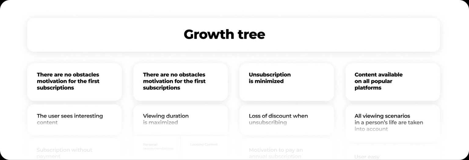
We visualized the business strategy using a growth tree. We described possible ways of product development in the form of branches and noted which branches the business wants to grow, which ones should be prioritized, and which ones can be postponed for the time being.
This method seems abstract only at first glance — in fact, it allows us to clearly see the priorities that we will work with first.
Why user should subscribe
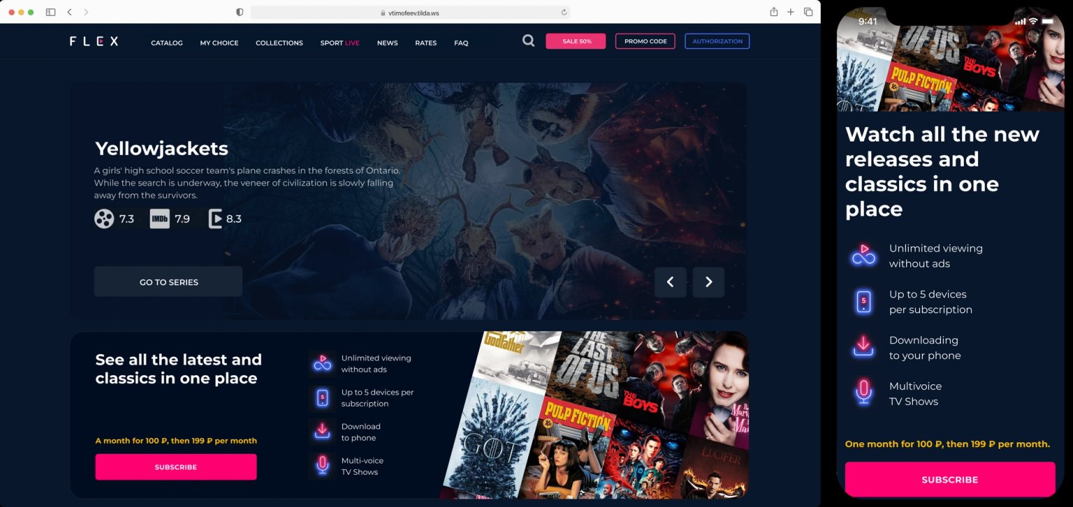
We suggested using promotional blocks to unauthorized users in prominent places so that the user always sees them when exploring content.
Login and registration
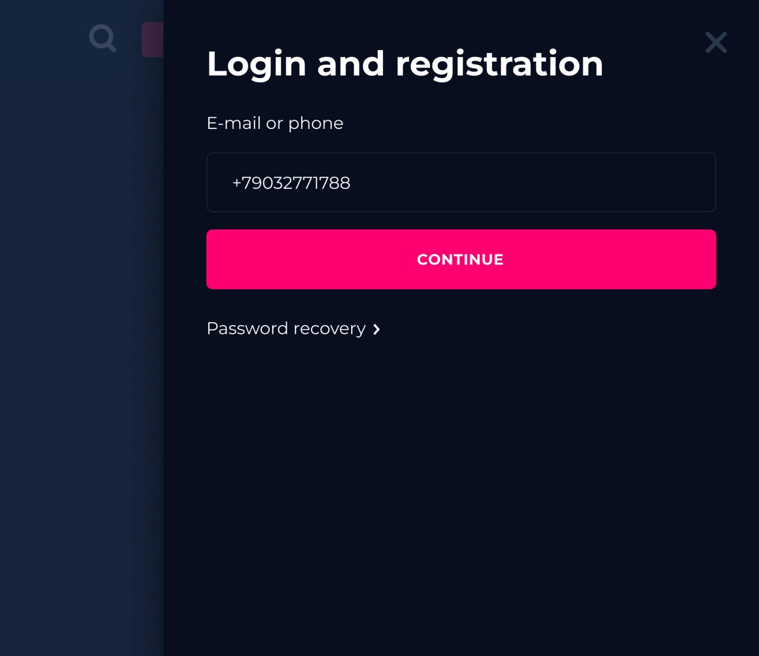
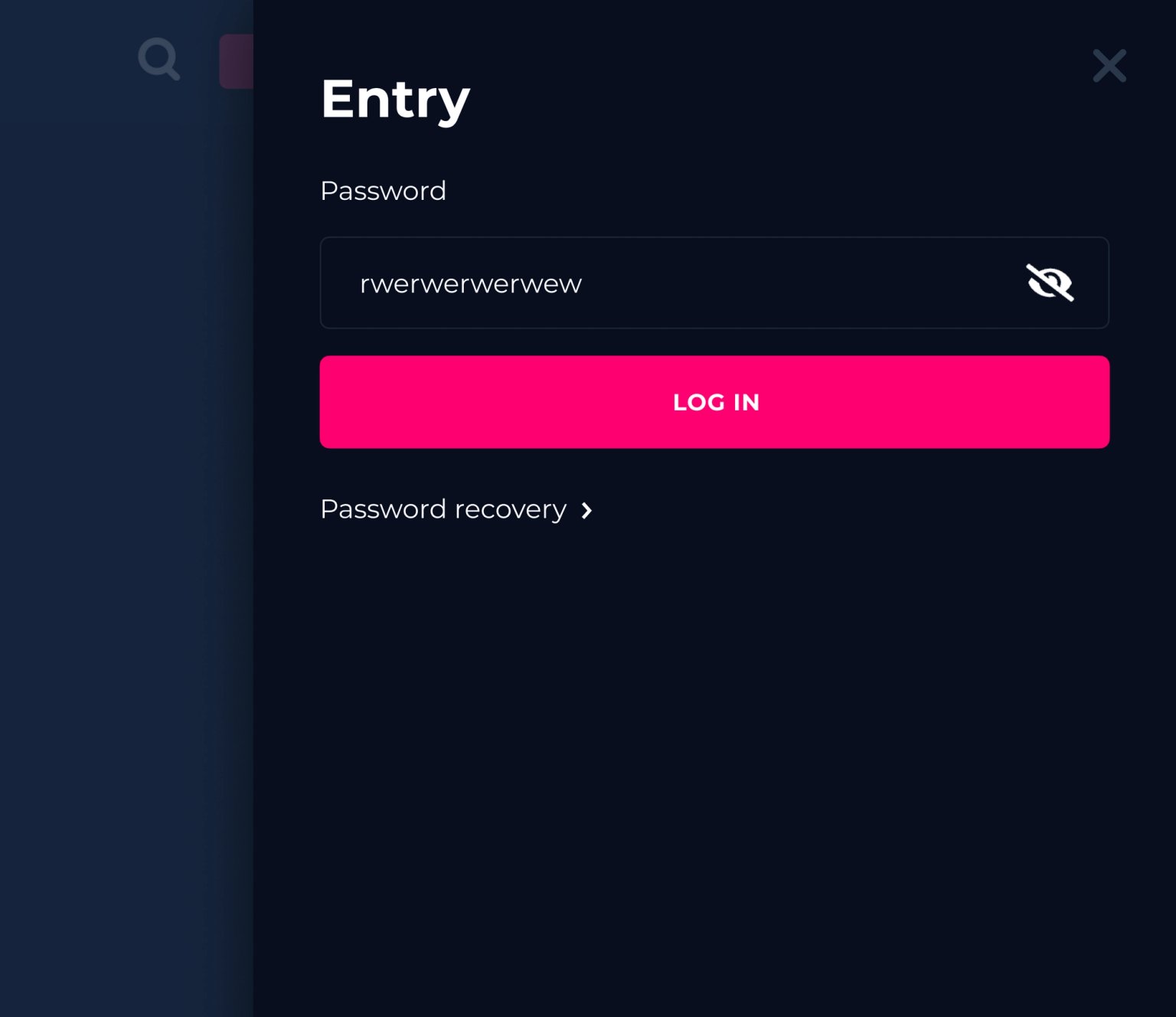
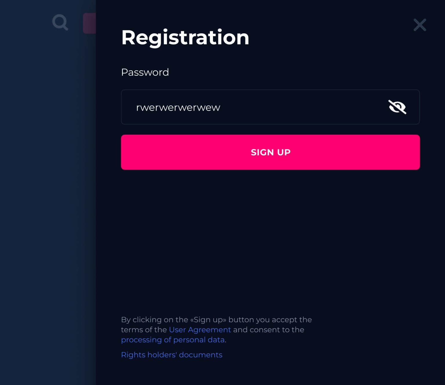
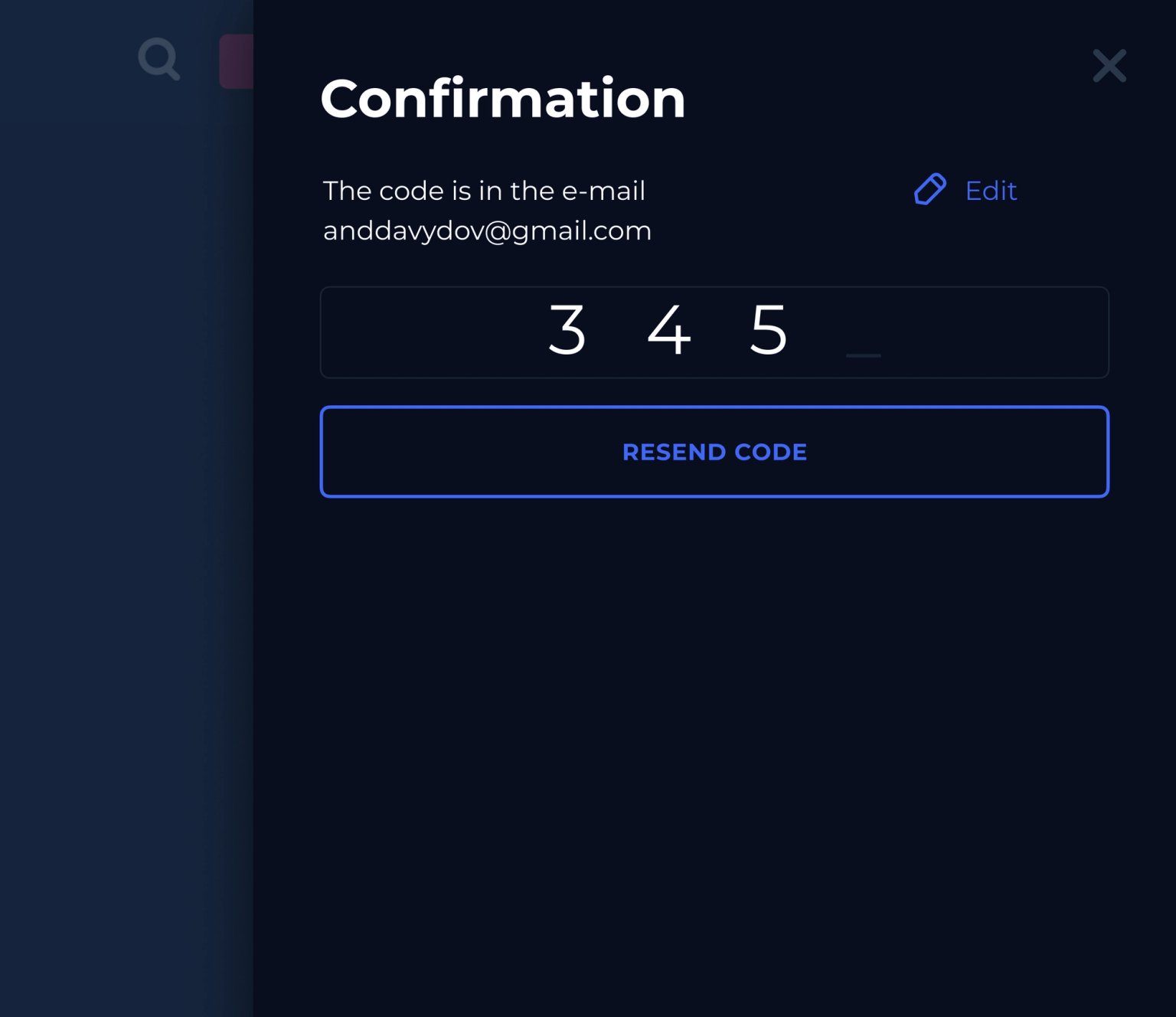
We advised Flex to merge user login and registration windows so that the system doesn't ask unnecessary questions or take up time. If the mail or phone is in the database — users need authorization. If not — registration. Users can recover your password here, without going to another screen. Thus, the user does not lose the page he needs because of registration and does not get annoyed.
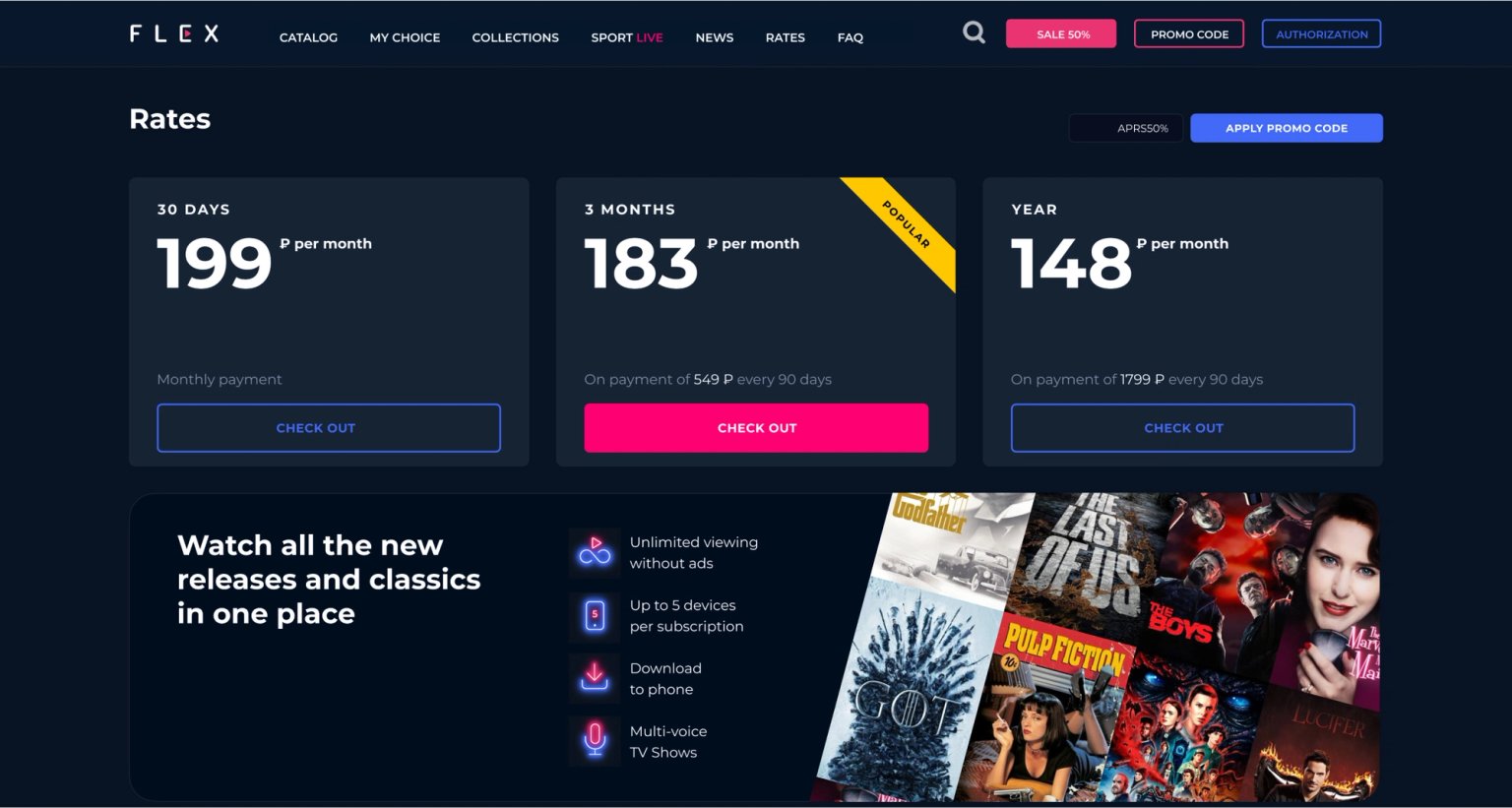
Rates
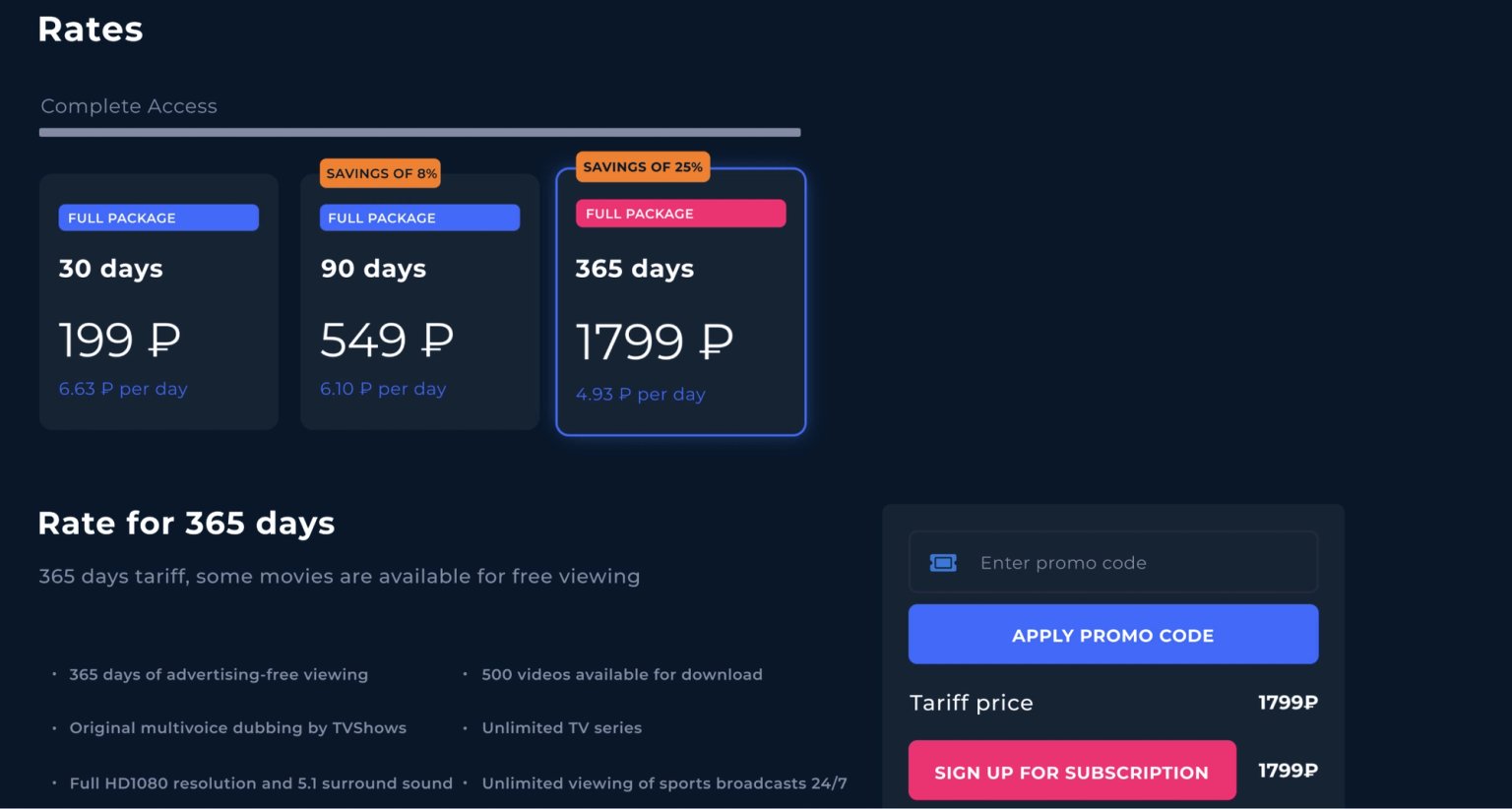
Highlighted how to better show the benefit in tariffs, so that the user makes a decision to subscribe.
Children's profile
If children and parents watch content from the same profile, the algorithm will offer cartoons to parents and uninteresting or even dangerous adult content to children. A quick switch to the children's profile solves this problem.

Player
Showed how to improve timeline navigation and reduce the number of clicks to change speed, quality and subtitles.


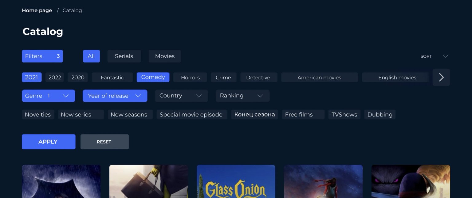
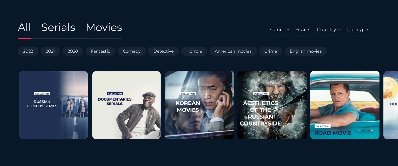
Choosing a movie or series
We showed you how to unload the cumbersome filter, making it easier and more intuitive to use.
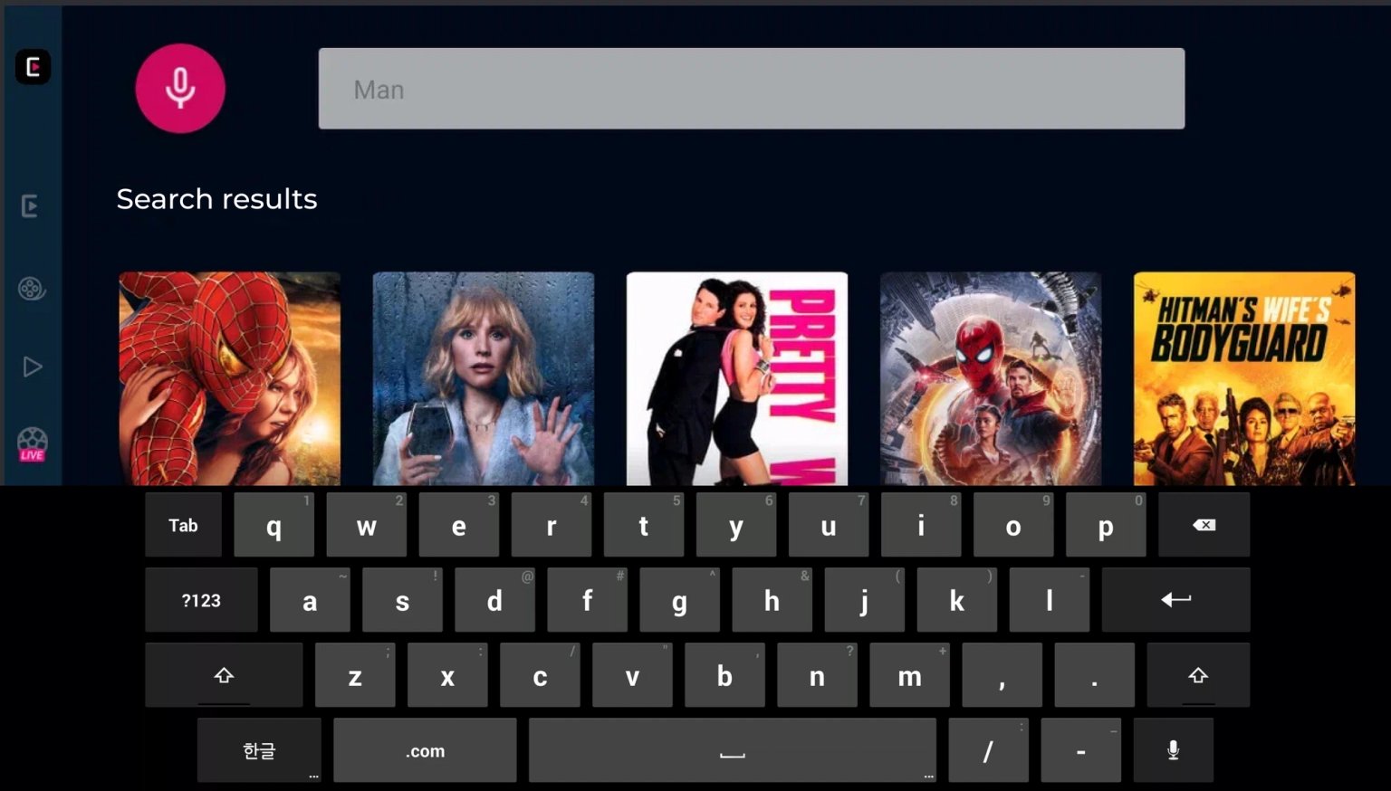
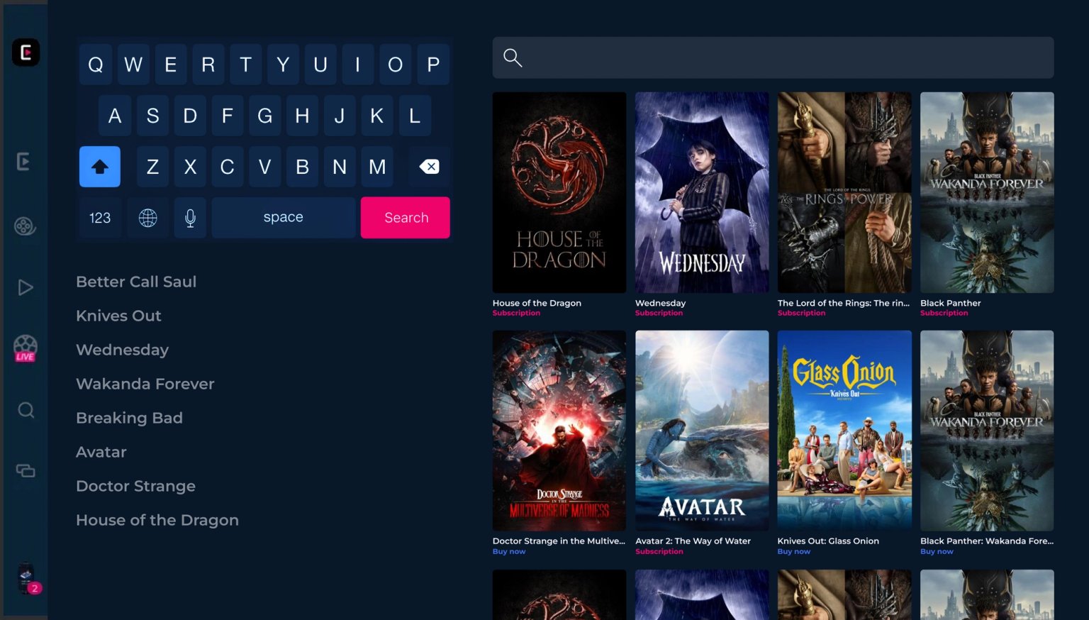
Search on a TV with a remote
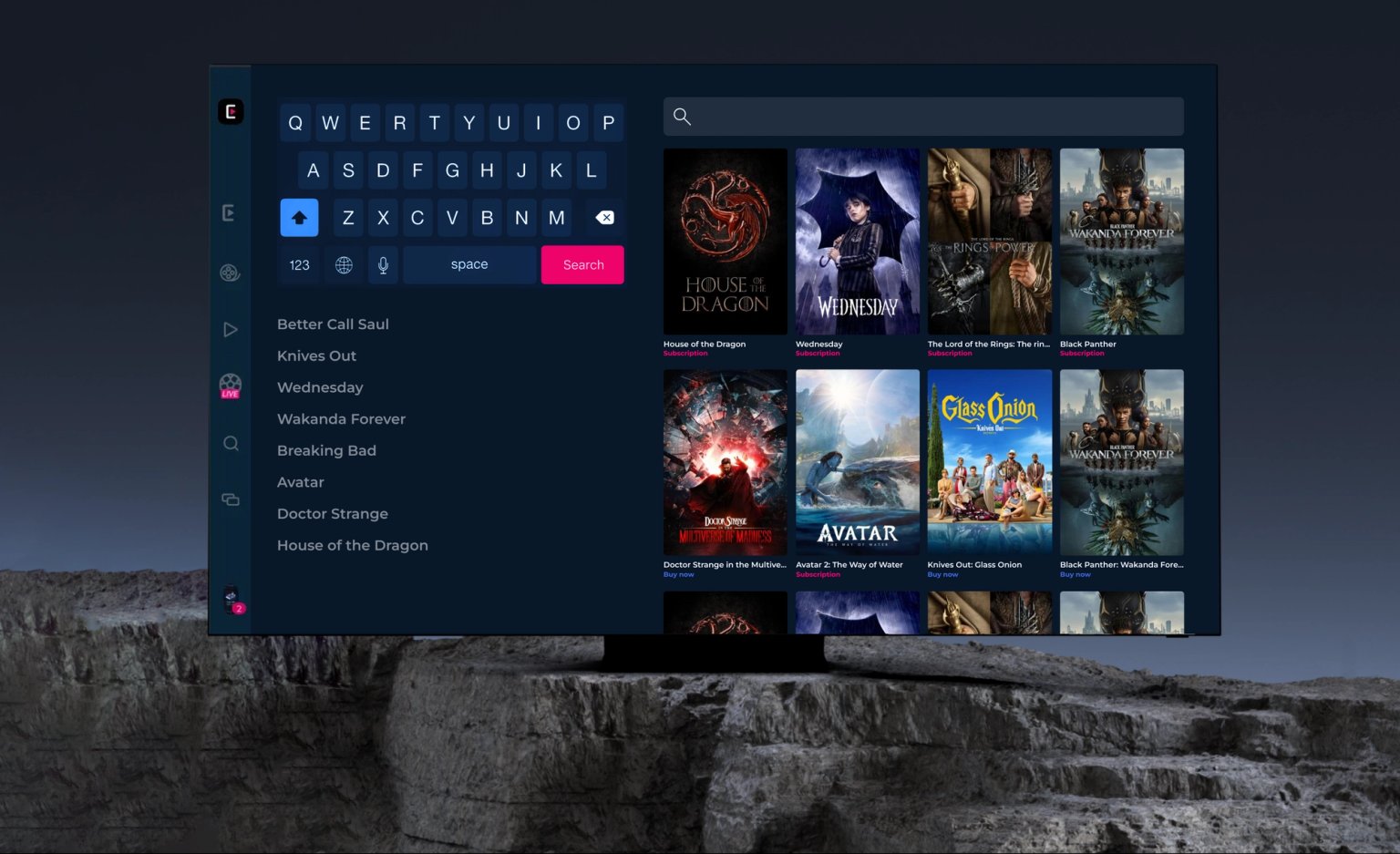
Searching for a movie on your TV with the remote is almost always inconvenient, especially if there's no voice input. We suggested showing both the keyboard, tooltips, and input field at the same time, and the result is bingo! Elements do not overlap each other, and as you enter text you can switch to the prompt and the result.
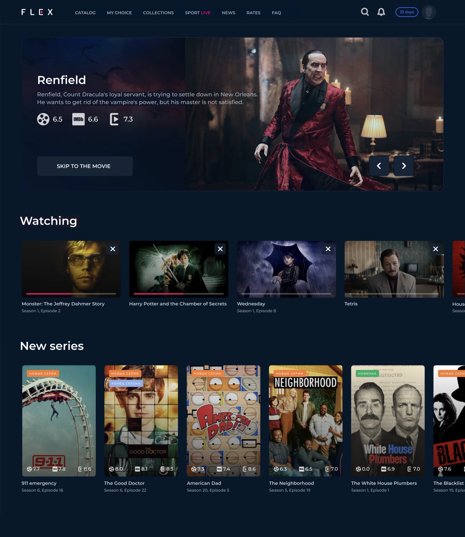
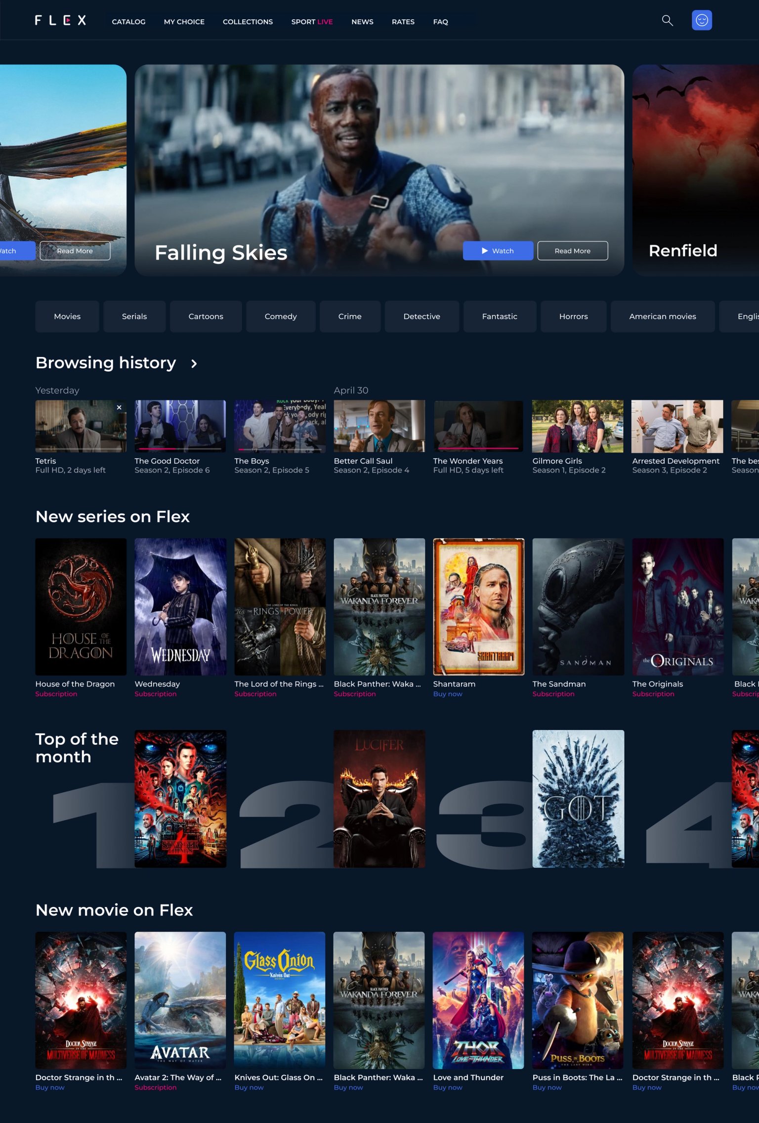
Home screen
Suggestions increase the concentration of content and make the home page more informative. The slider immediately rotates the trailer, now it looks more expressive. We combed the floors with a grid of cards, added headings and selections to satisfy the viewer from the user story — who wants to watch something, but does not know what exactly.
Outcome
Digital product development
for complex, high-loaded multi-input digital services
We research, design, write text, help launch features and services, analyze metrics and develop
By clicking the button I agree to the processing of my data
Message sent
We'll get back to you soon