Product design for Emex warehouse
- ux-research
- design
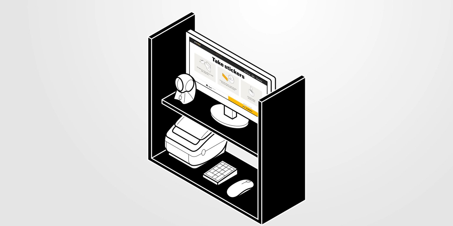
Overview
Emex is one of Russia's largest auto parts marketplaces. Every day, sellers deliver more than 50,000 items of auto parts to the Emex warehouse.
Problem
Sellers often bring goods to the Emex warehouse late, drivers get confused and delay loading. On the scale of such a large marketplace, even small delays add up to multi-million costs.
Solution
For the drivers, we decided to redesign the terminal interface, create a manual and update the navigation in the drop-off area. To solve this task, we "went into the real world": we did a large field study, examining the behavior of drivers. Each solution was tested for its "survivability" in live conditions.
In addition, we motivated suppliers to deliver goods on time (and without sanctions or threats).

Seller terminal
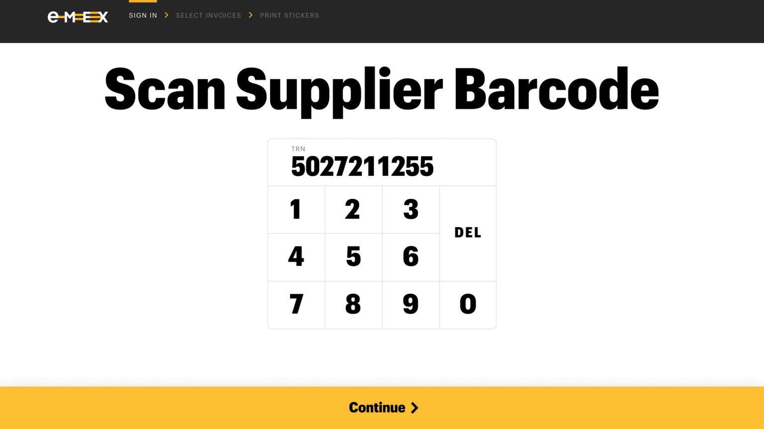
When dropping off a shipment, the driver at the terminal enters the seller tax number or scans the barcode of the seller from whom he brought the shipment. The terminal is located on a sunny ramp, so we made all text and interactive elements as contrasty and large as possible, and placed buttons in the corners of the screen to make them easy to reach with a finger even on the run.
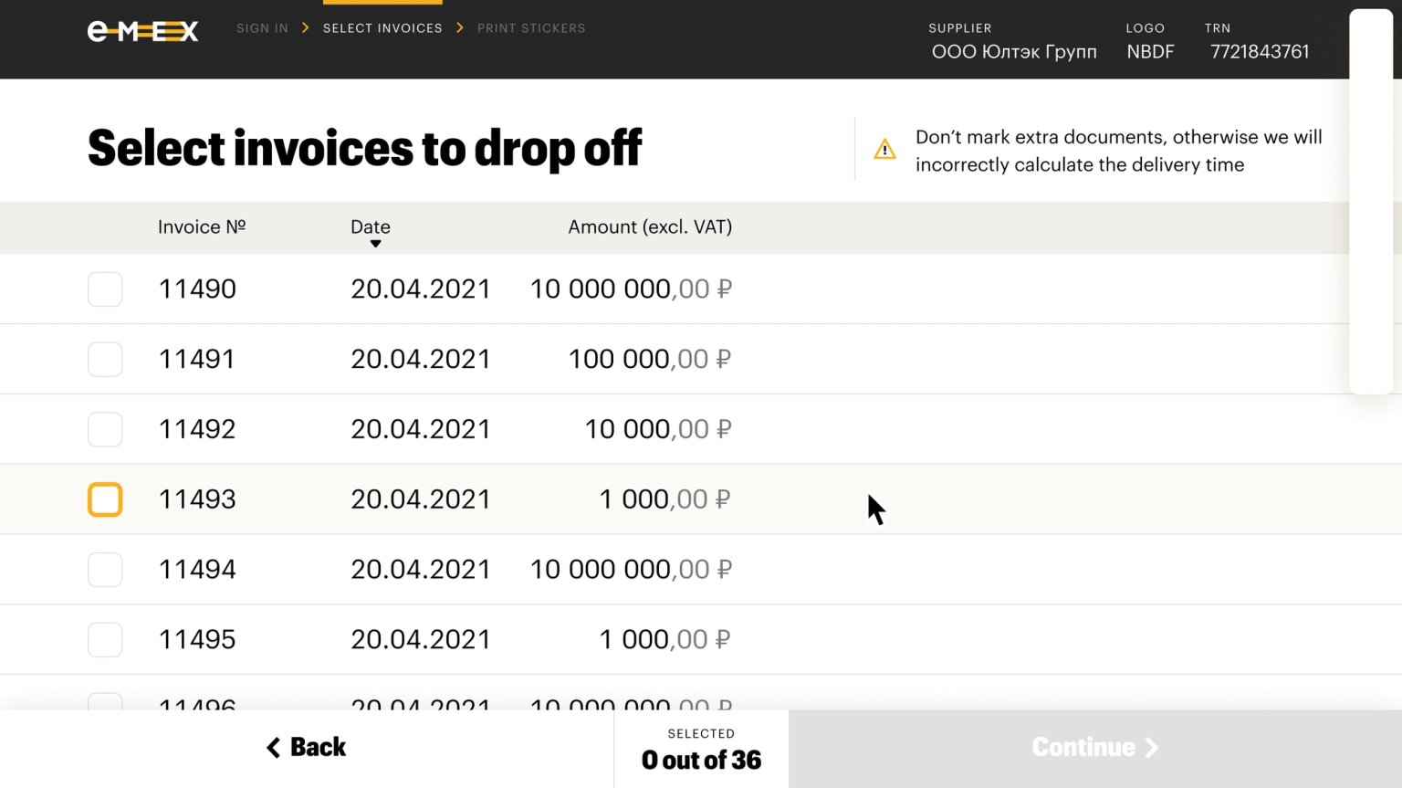
Delivery selection and labeling
We removed unnecessary data from the list of documents. Now the price or number is enough to select the required document, and the documents themselves are now easy to sort by date. We also removed the interactive elements, enlarged them and placed them on the edges of the screen. Now the driver can select documents by clicking on the whole line, not only by a checkbox.
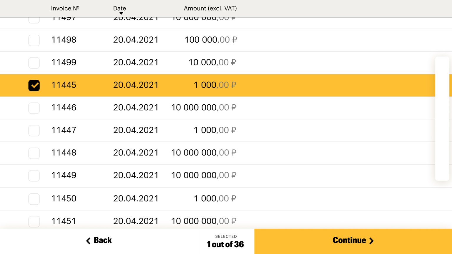
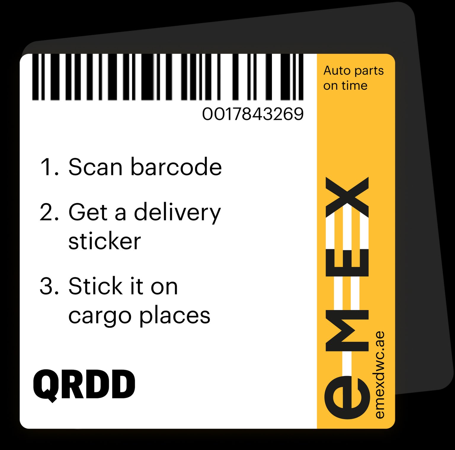
On the last screen we added a reminder for drivers that it is important to put stickers on all goods, and after that — to put paper documents in a special box. If there aren't enough stickers, drivers can scan the barcode and print more.

Navigation and instructions
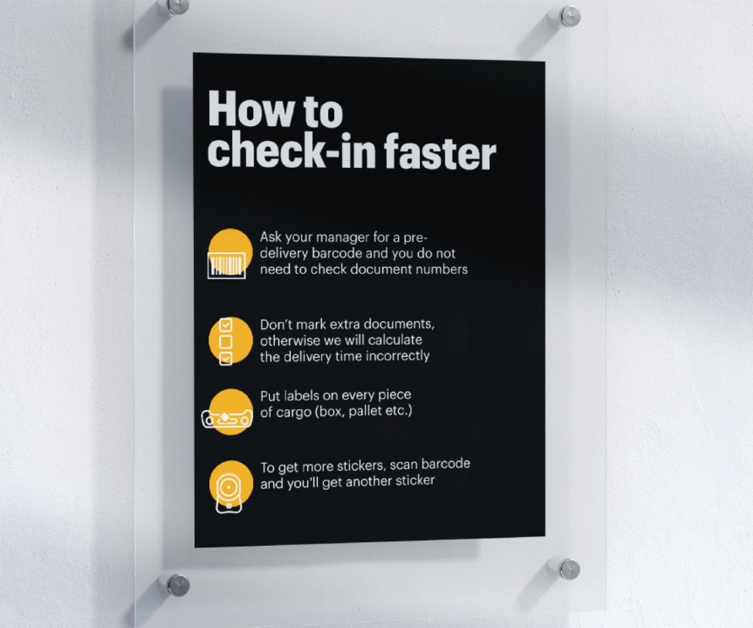
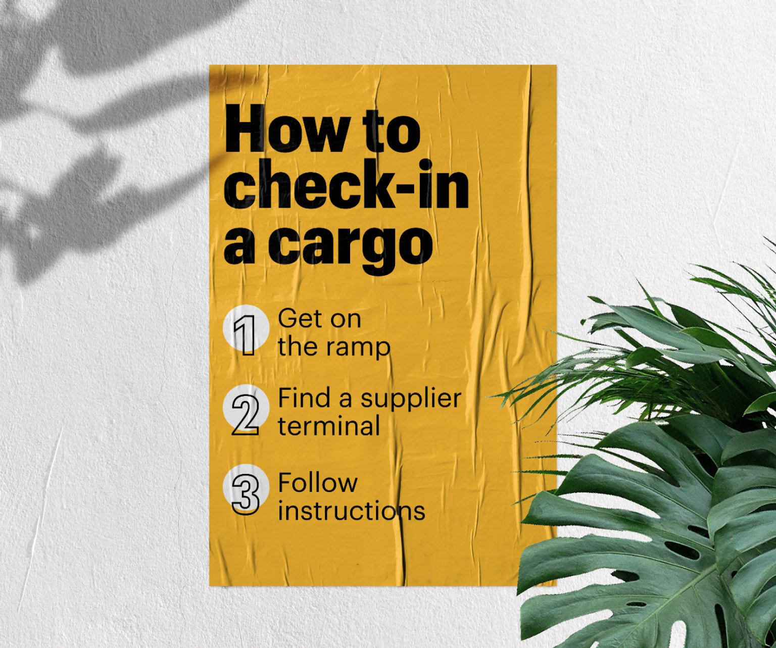
We researched the behavior of drivers who enter the warehouse for the first time and created simple posters with instructions on how to drop off cargo and signs. One poster was placed in the smoking room, where drivers most often go for help if they don't know what to do. Three more are placed where the driver gets out of the car.
There are signs with instructions on typical mistakes near the terminal.

Rating
Each offer on the Emex website has a rating. In order to increase the motivation of sellers to deliver on time, we have increased the impact of delays in the formula for calculating the rating on the site.
We emailed our sellers to notify them of the changes, outlining the factors affecting the rating and highlighting late arrivals.

Result
Design & development as a Service
$5000 /month
What’s included: One task in progress at once · Typical turnaround within 48 hours · Webflow builds included · React and .NET development available · Stop or pause whenever you need
By clicking the button I agree to the processing of my data
Message sent
We'll get back to you soon