Identity of Adcorn viral advertising automation service
- Naming
- Logo
- Branding
Overview
Adcorn helps companies and bloggers quickly and inexpensively attract customers and followers from social media.
The bureau came up with the service's name, logo and identity.
Challenge
The service uses face-to-face selling. Salespeople explain the product at conferences, meet-ups and private presentations. Later, potential customers are 'caught' by contextual advertising with promotions and free webinars.
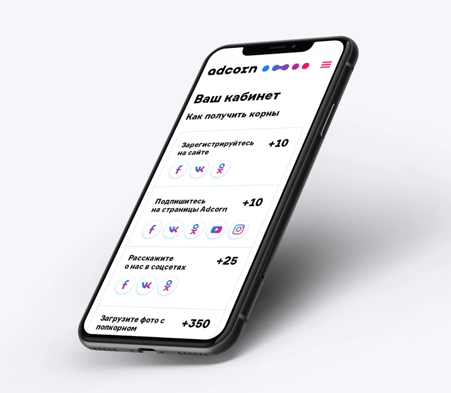
Consistent, recognisable graphics were required for all touch points.
Result
The name is made up of two words: advertising and popcorn. It reflects the essence of the service: the explosive spread of advertising through entertainment and communication.
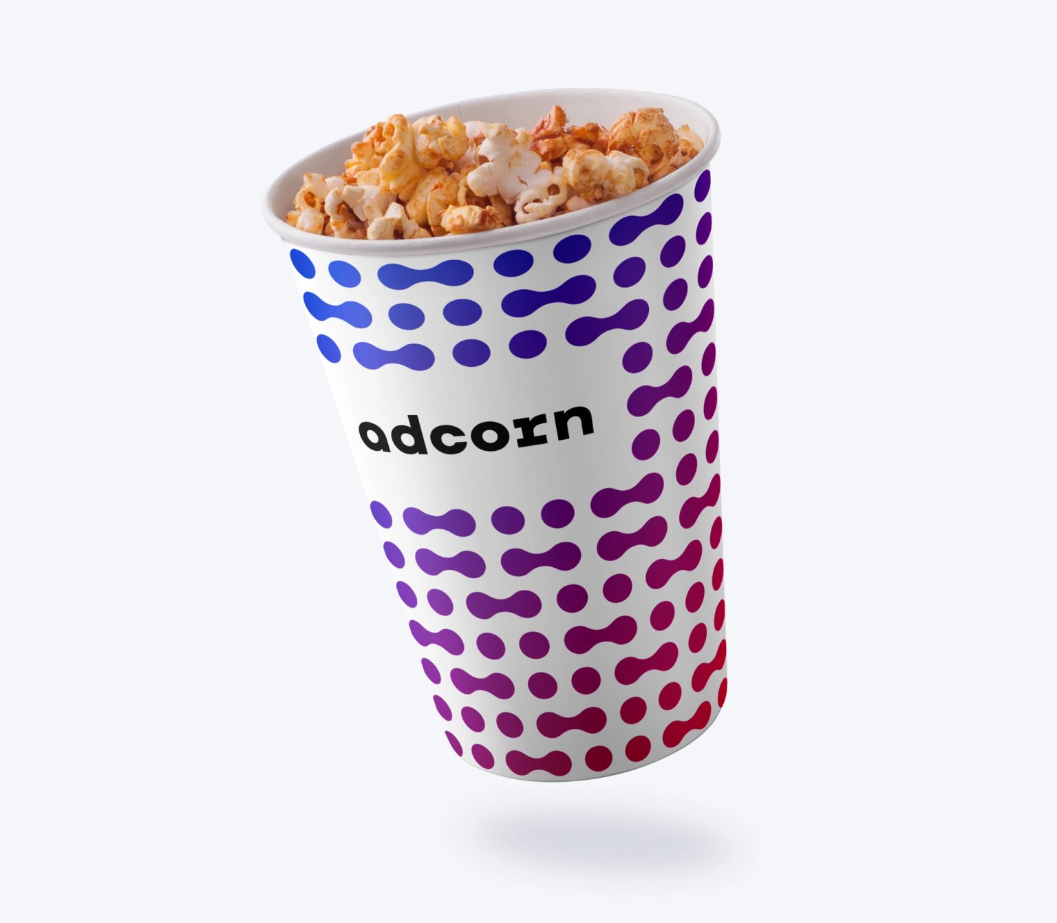
In the logo we illustrated the idea of spreading viral advertising — from person to person. We reflected this as a continuous process of sharing.
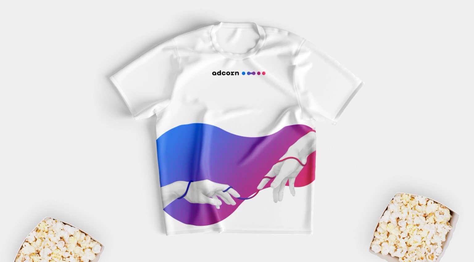
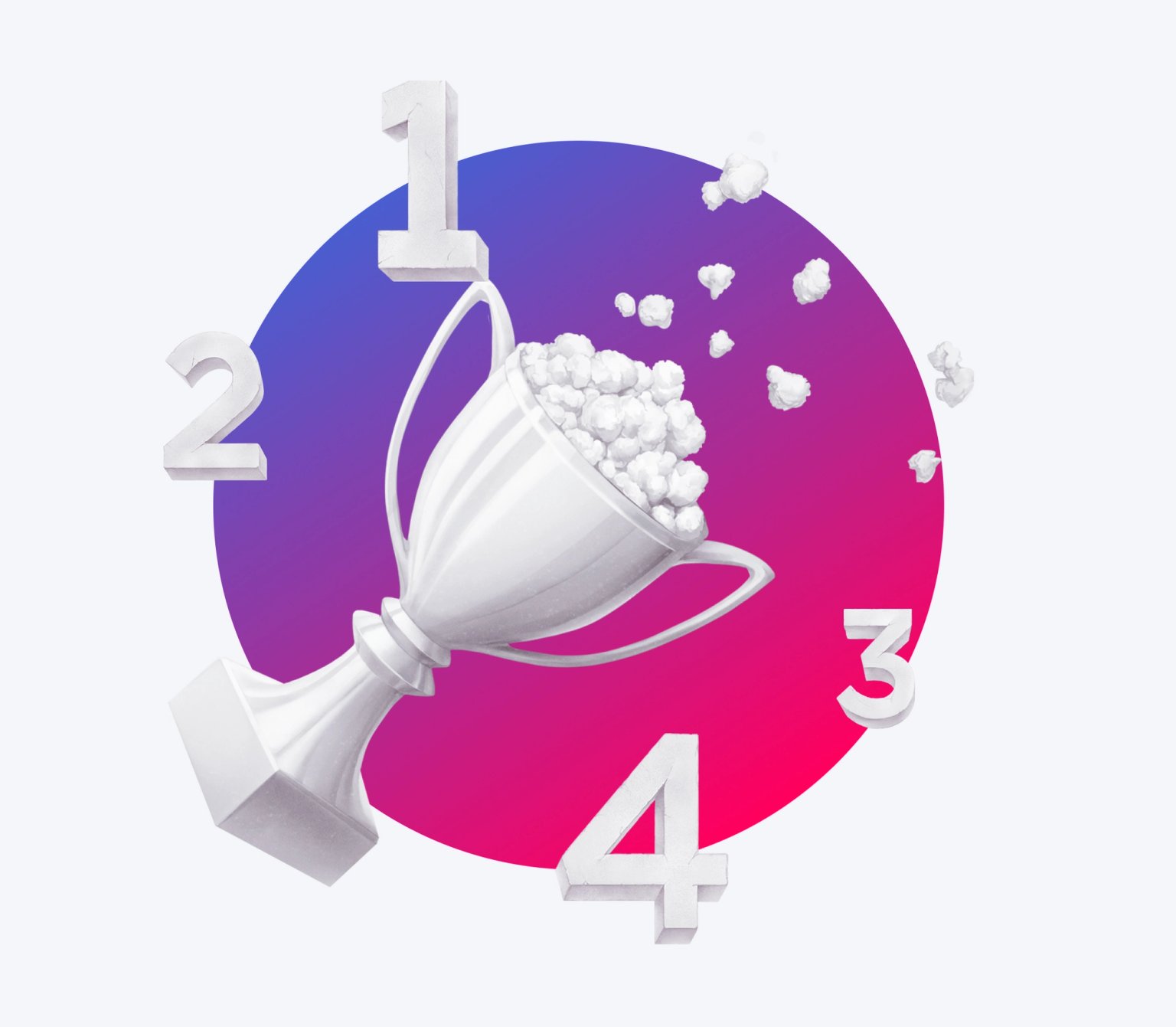
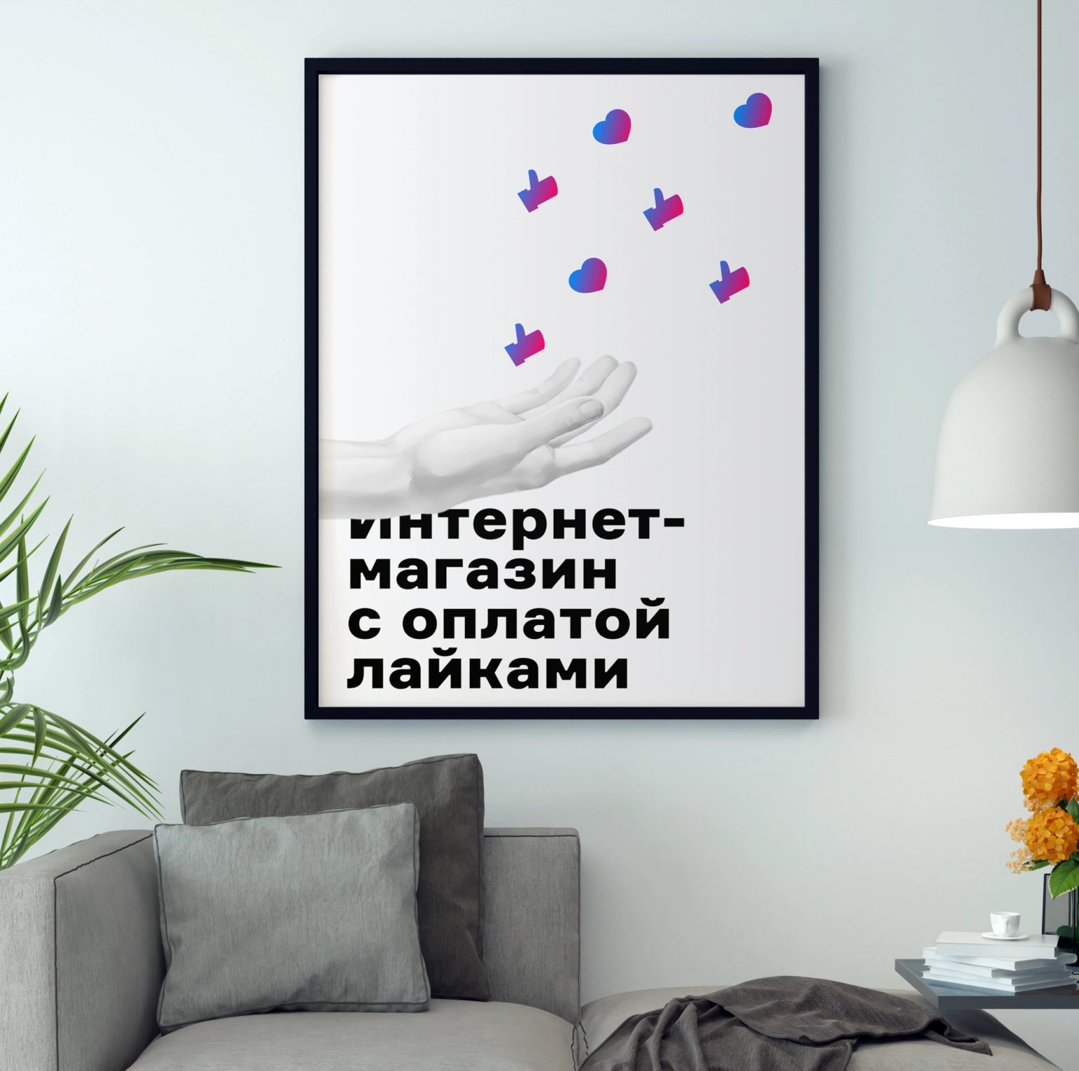
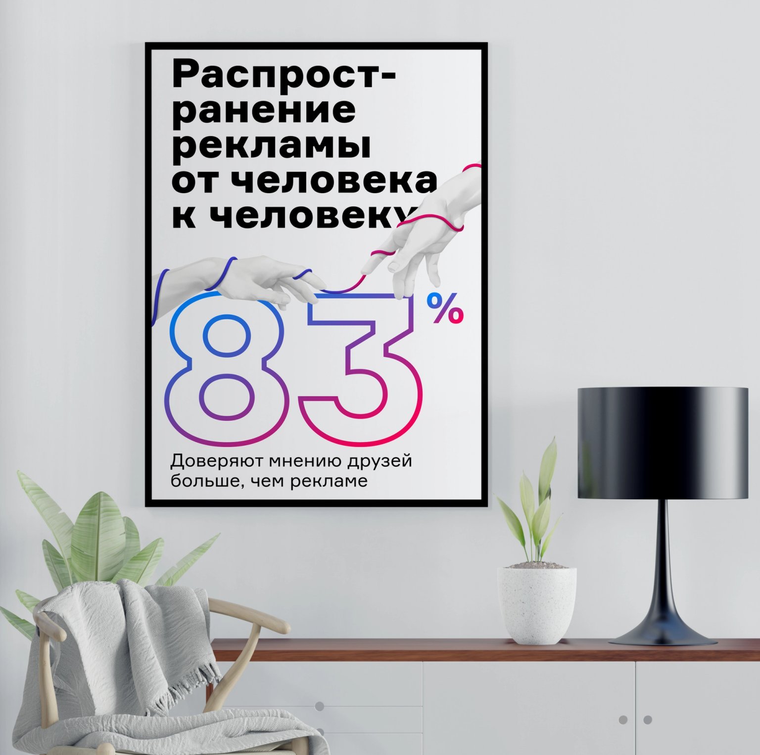
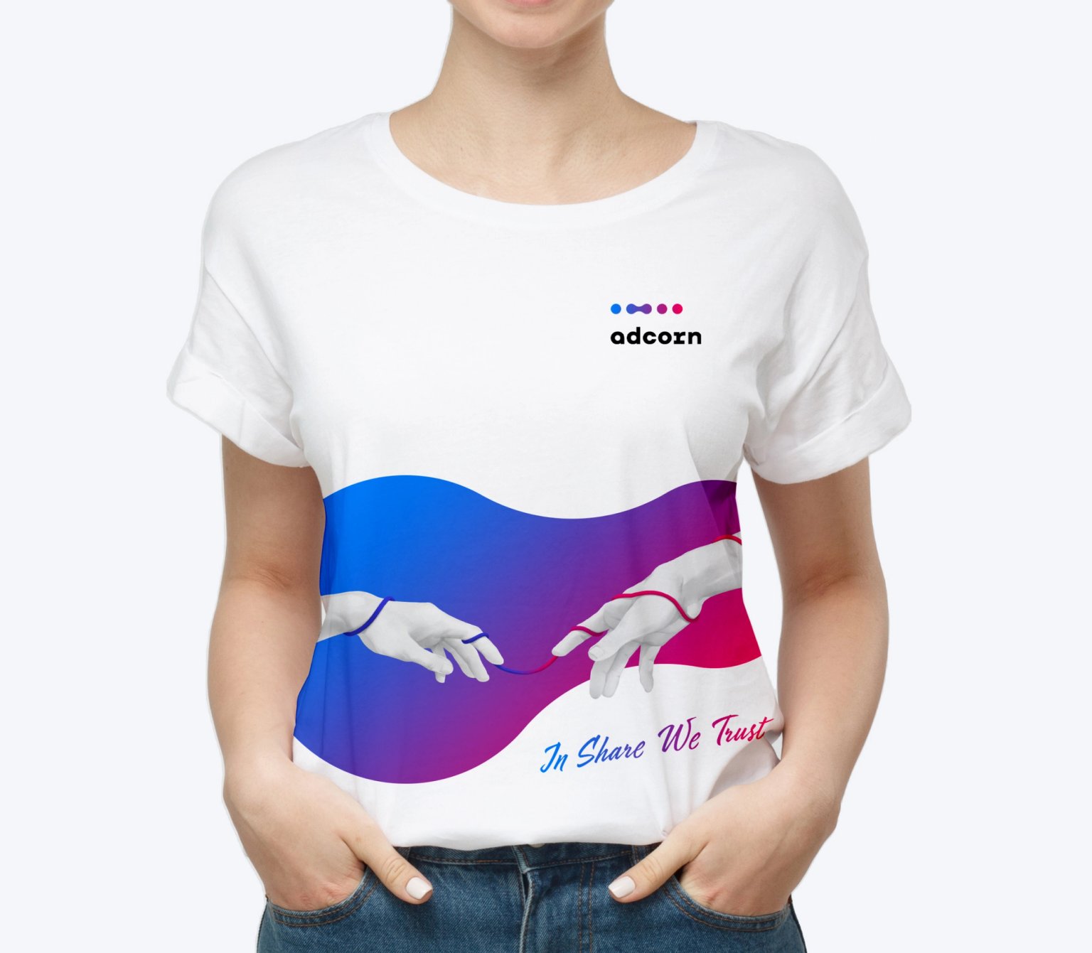
Based on an analysis of competitors and similar services, we chose a unique combination of round shapes with a blue and scarlet gradient combined with light black and white illustrations. This combination always looks good and scales well.
The gradient refers to modern technology and the illustrations to antiquity and the very first way of transmitting information — from person to person.

The branded gradient, pattern and black and white illustrations easily brand any medium.
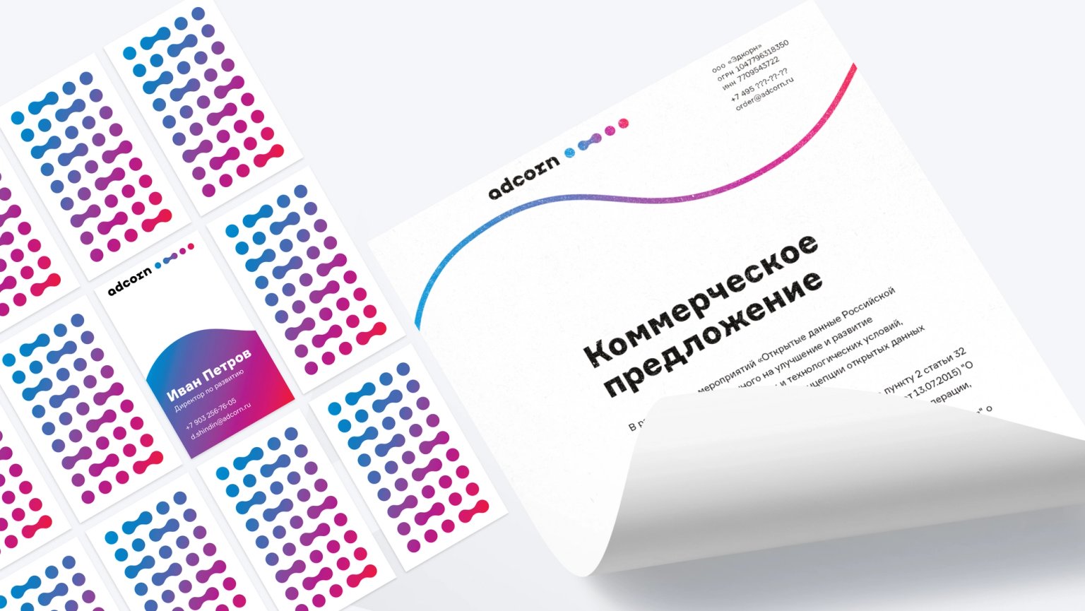
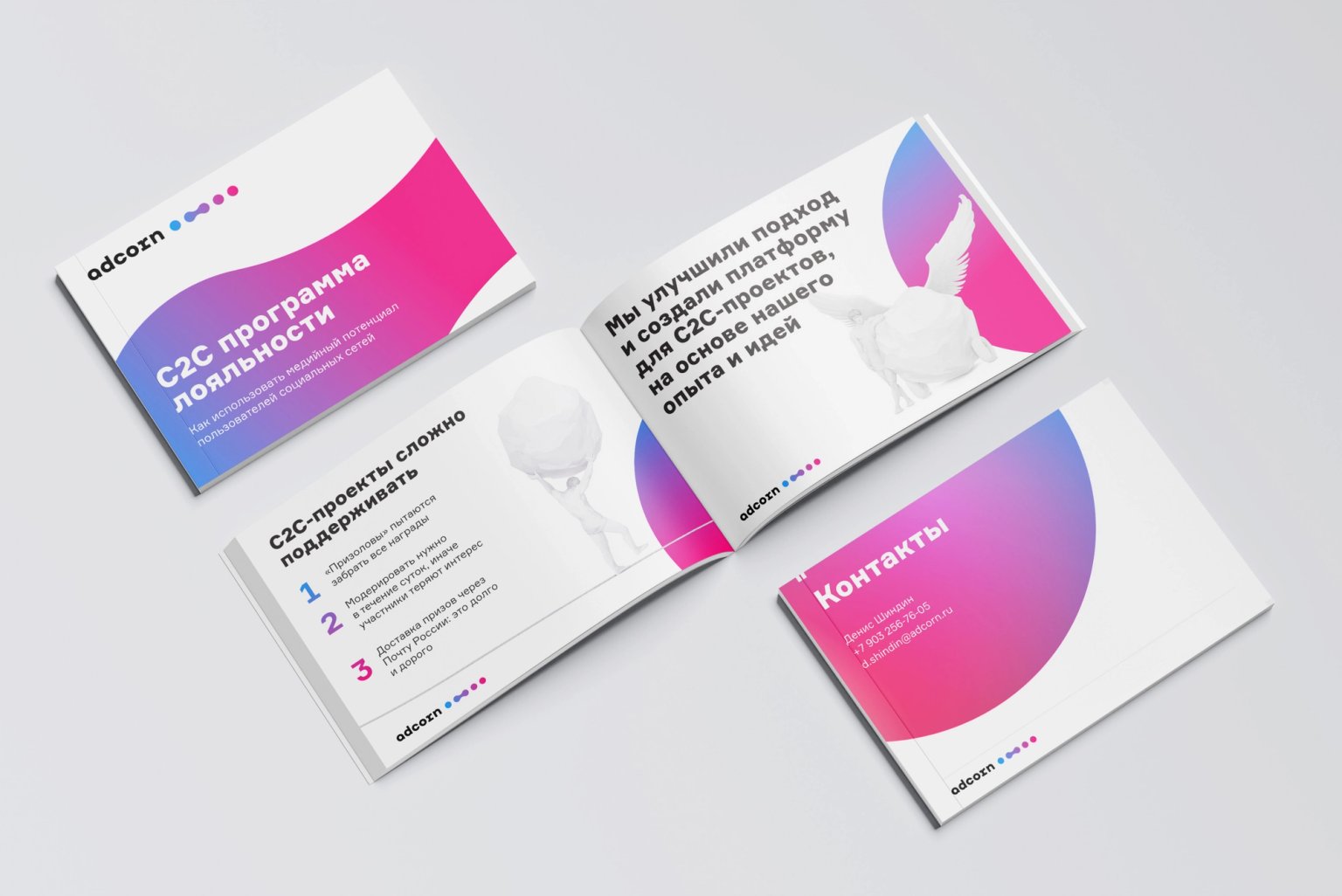
The bureau also designed a presentation of the service for personal sales to major clients.
Result
Design & development as a Service
$5000 /month
What’s included: One task in progress at once · Typical turnaround within 48 hours · Webflow builds included · React and .NET development available · Stop or pause whenever you need
By clicking the button I agree to the processing of my data
Message sent
We'll get back to you soon