Design system of link marketplace Serpzilla
- ux / ui
- frontend
- design

About the project
Serpzilla is a platform that allows advertisers and sites to place advertisements. Every day more than 100 000 users buy and sell advertising banners and links on the advertising marketplace.
Task
Serpzilla decided to combine several products into one. The new strategy required designing new usage scenarios and a complete redesign of the service. In addition, Serpzilla decided to continue launching separate services.
All this required the creation of a design system that would unify all the products and allow:
- Make all interfaces simpler and clearer
- Launch new features and services faster
- Spend less resources on future support
Result
Design system: components in Figma and vue.js, common scenarios and principles
We put together a design system that increases the speed of developing new services and merging old ones.
4 development teams and product managers are over-utilizing the common solutions we came up with. Users understand different services faster, and it takes less time to design and launch new features.
In addition, we developed typography, grid and principles of adaptation for different screens
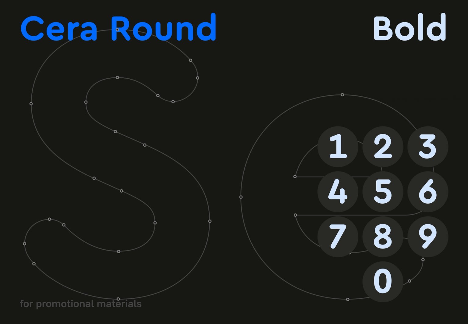
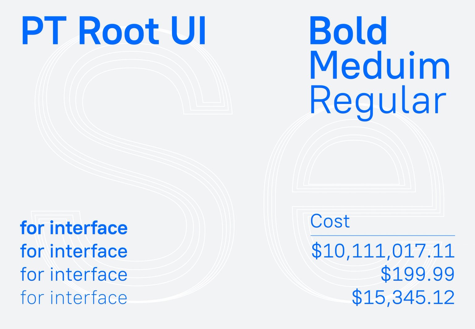


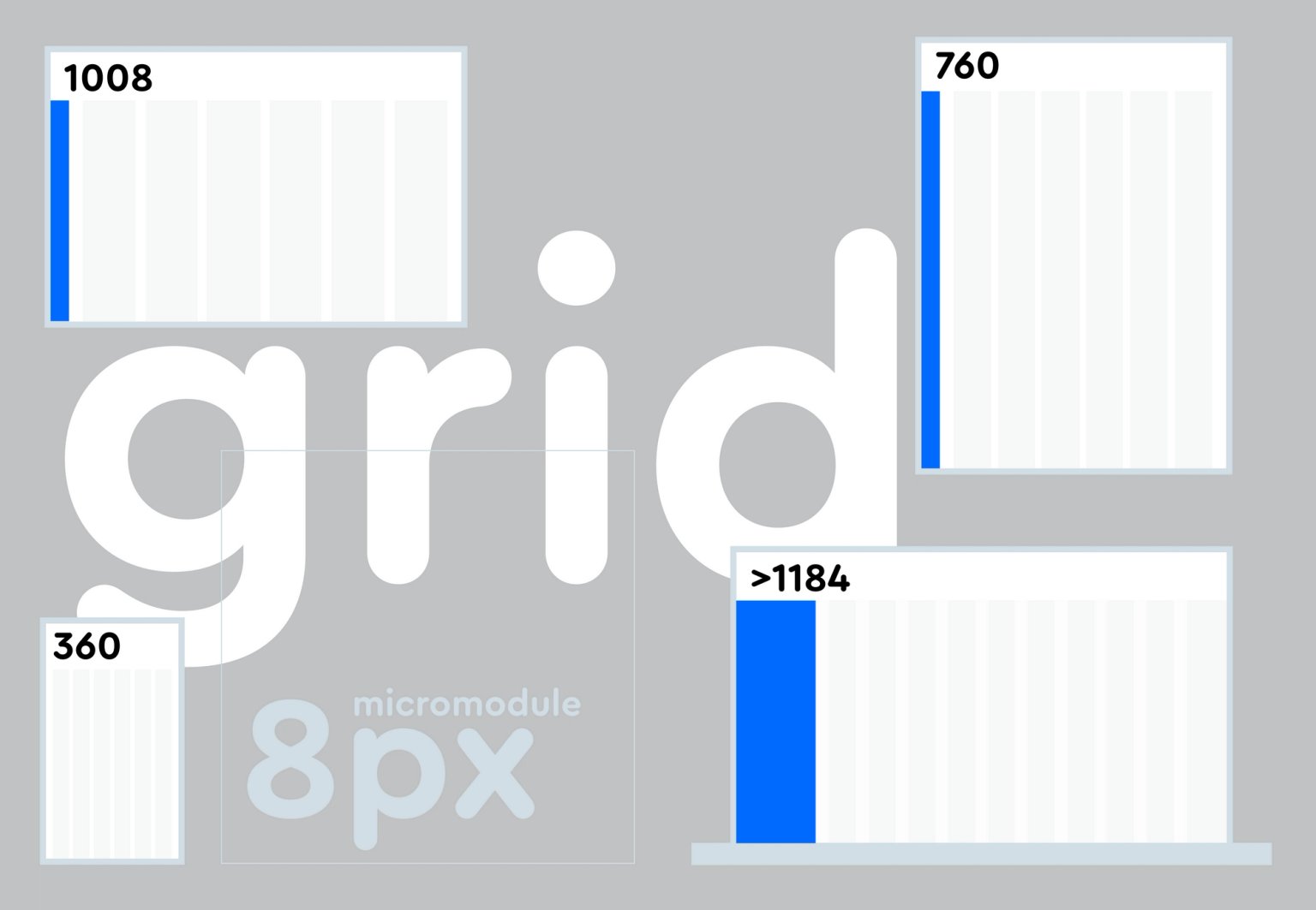
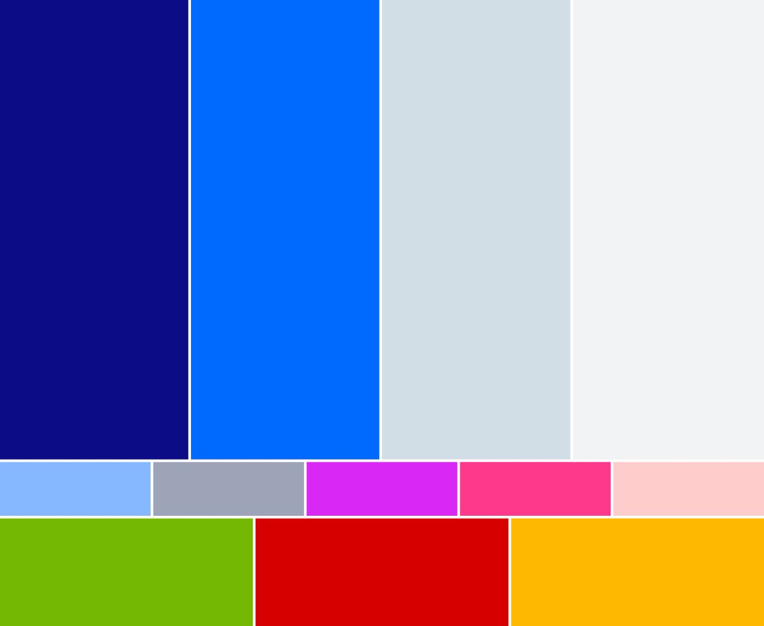
We presented the color system

Assembled the system of icons and drew the base grid


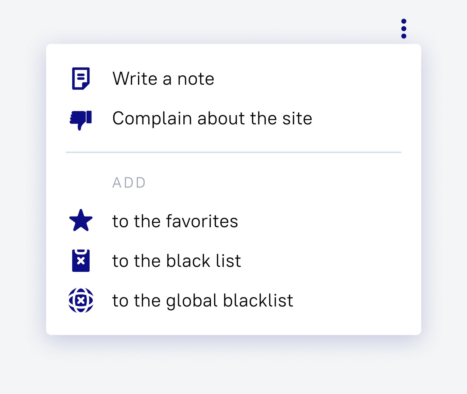

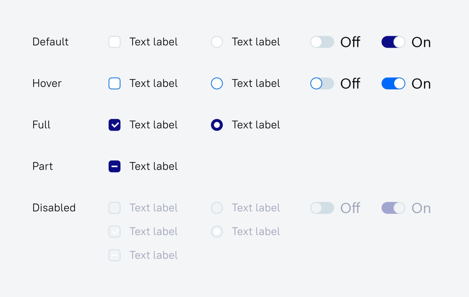
Designed interactive elements

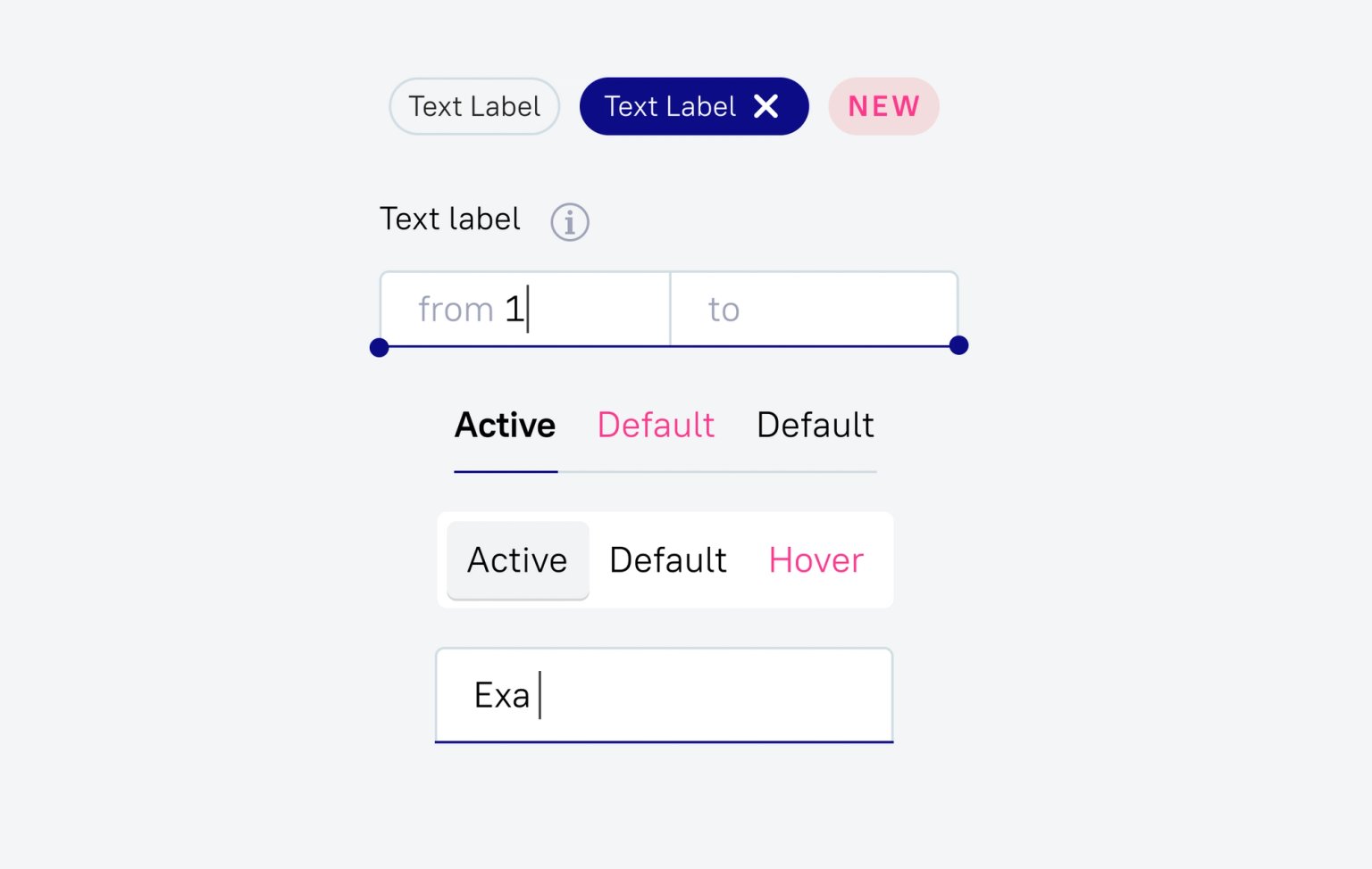
Gathered common components for all cases
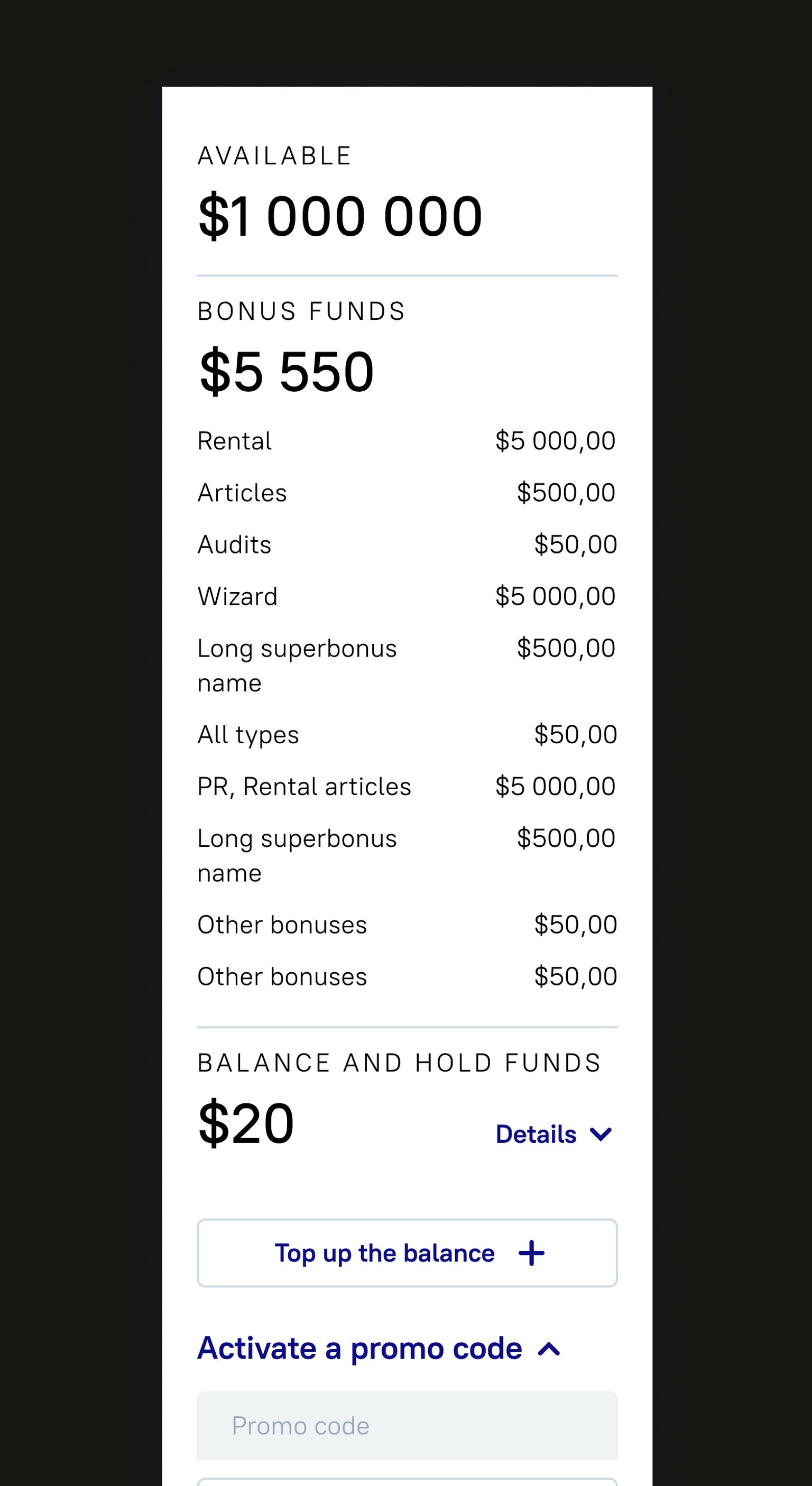
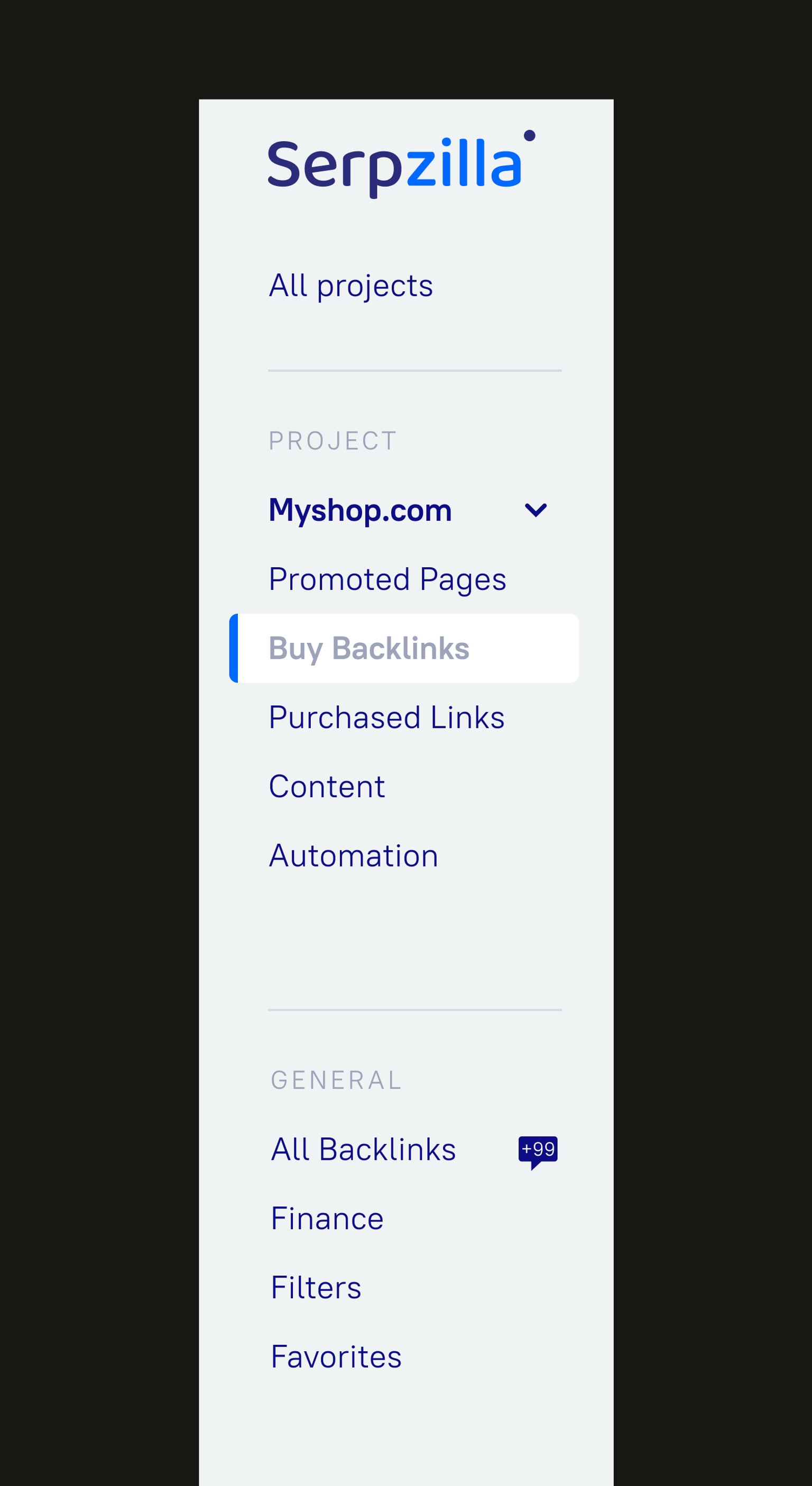
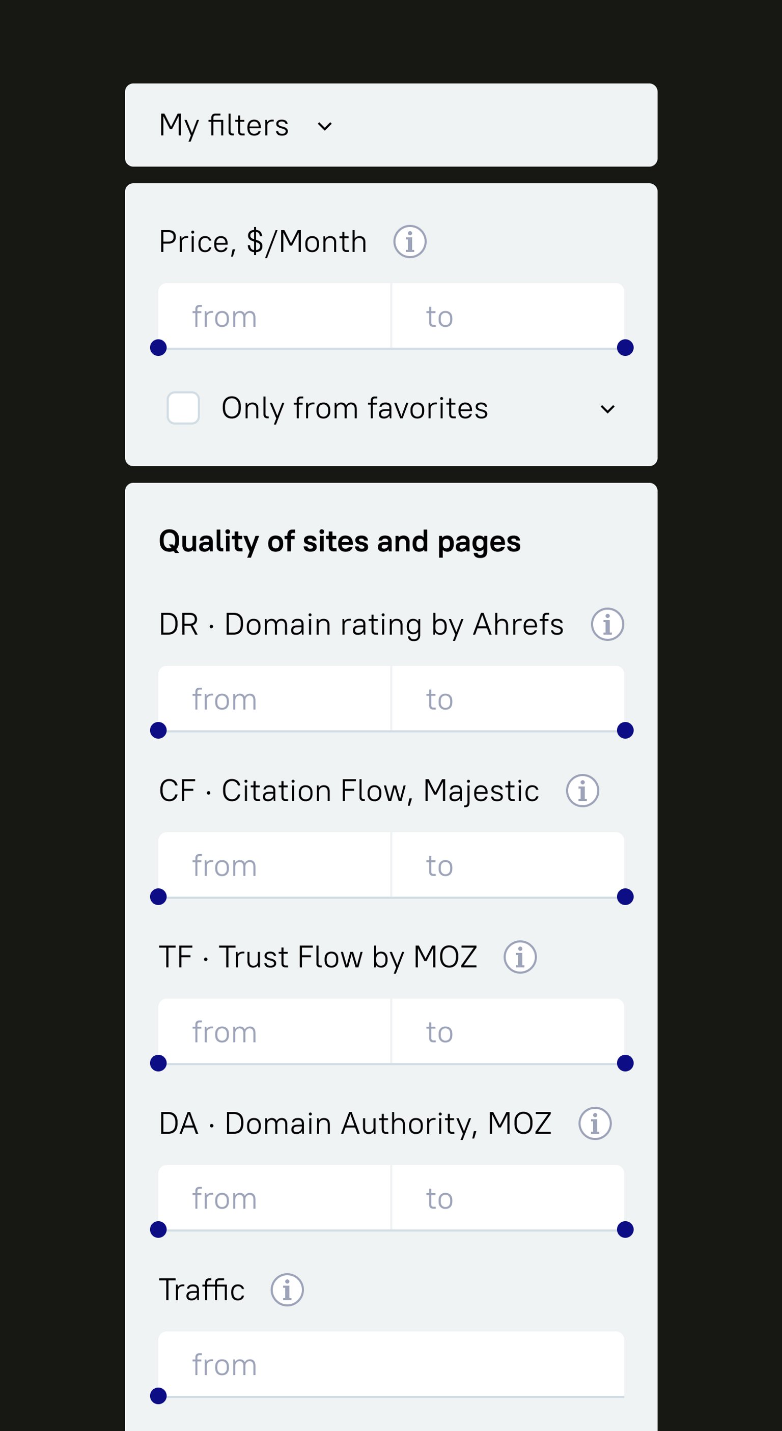

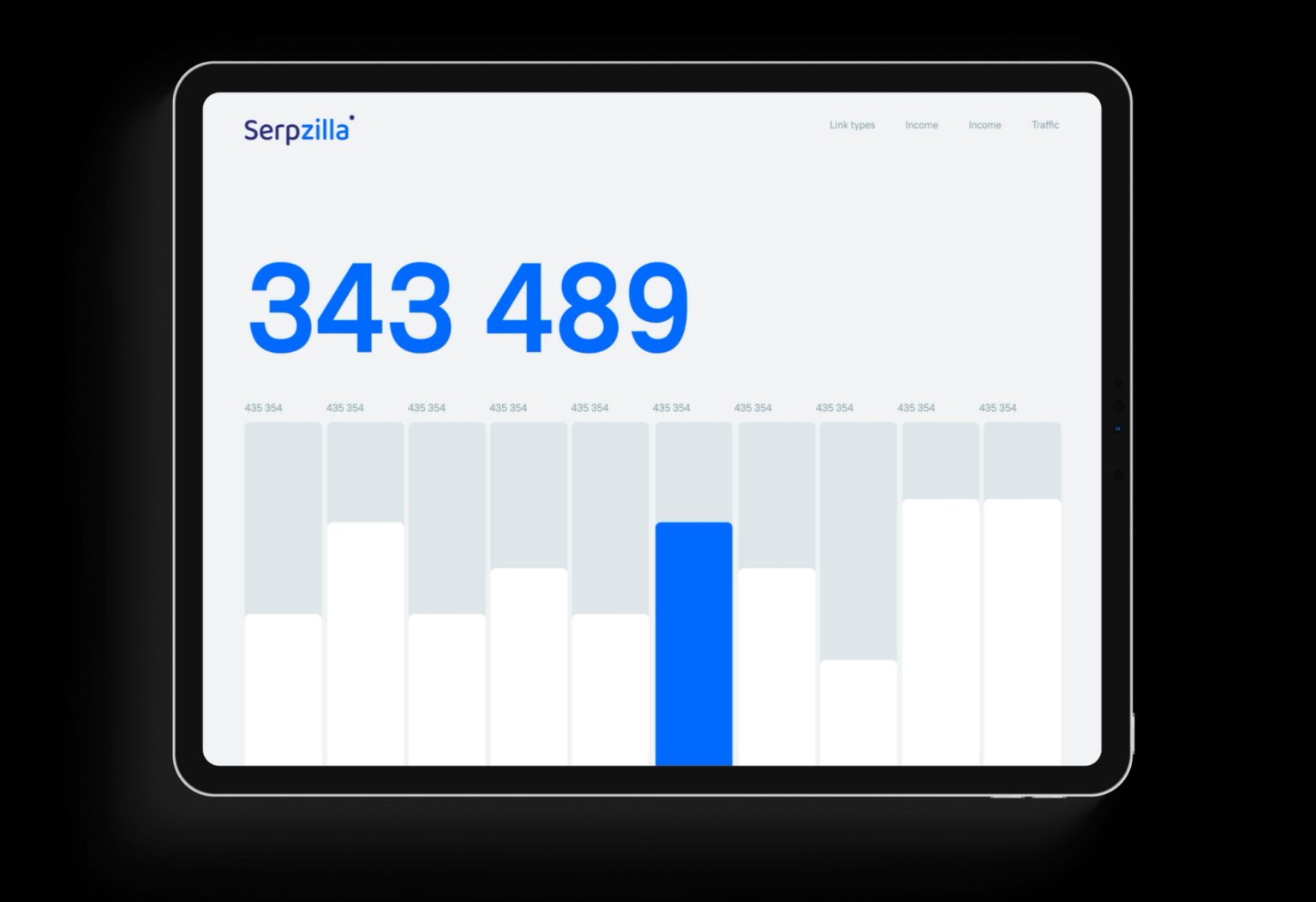
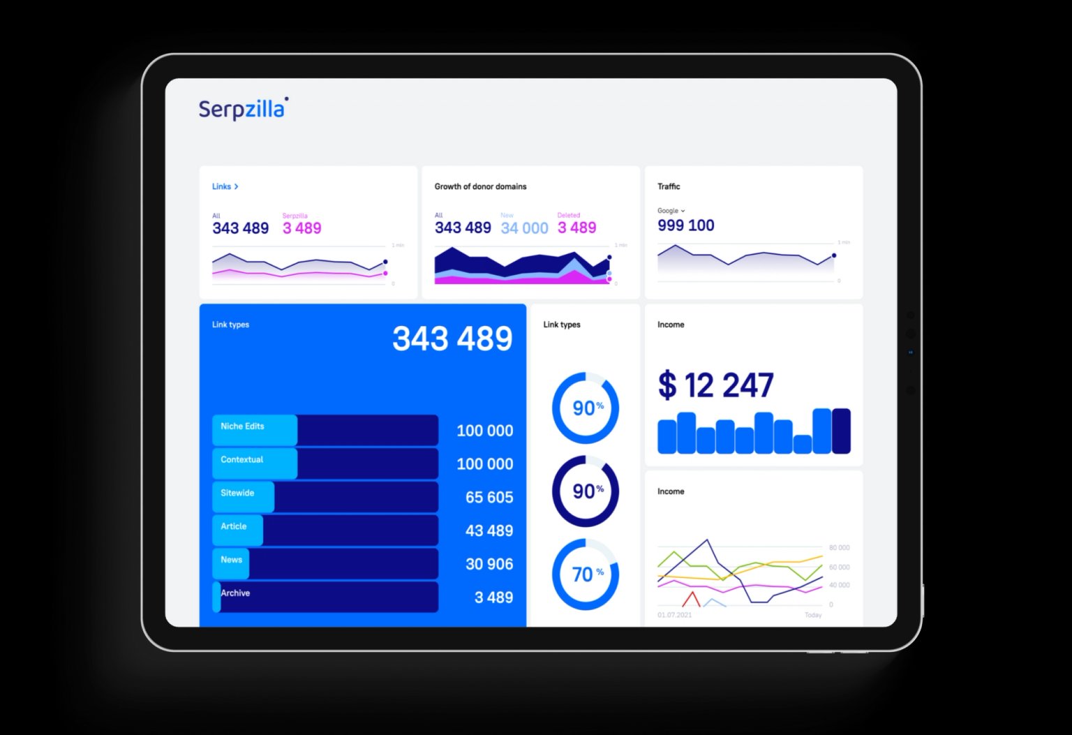
Examples
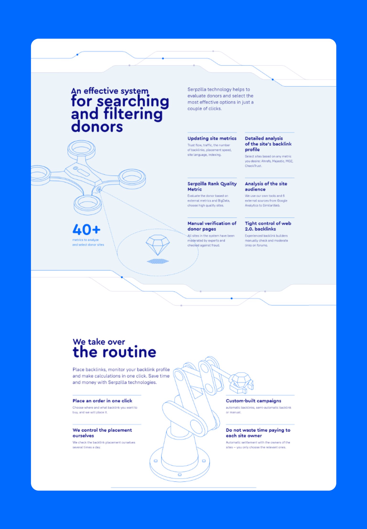
Marketplace
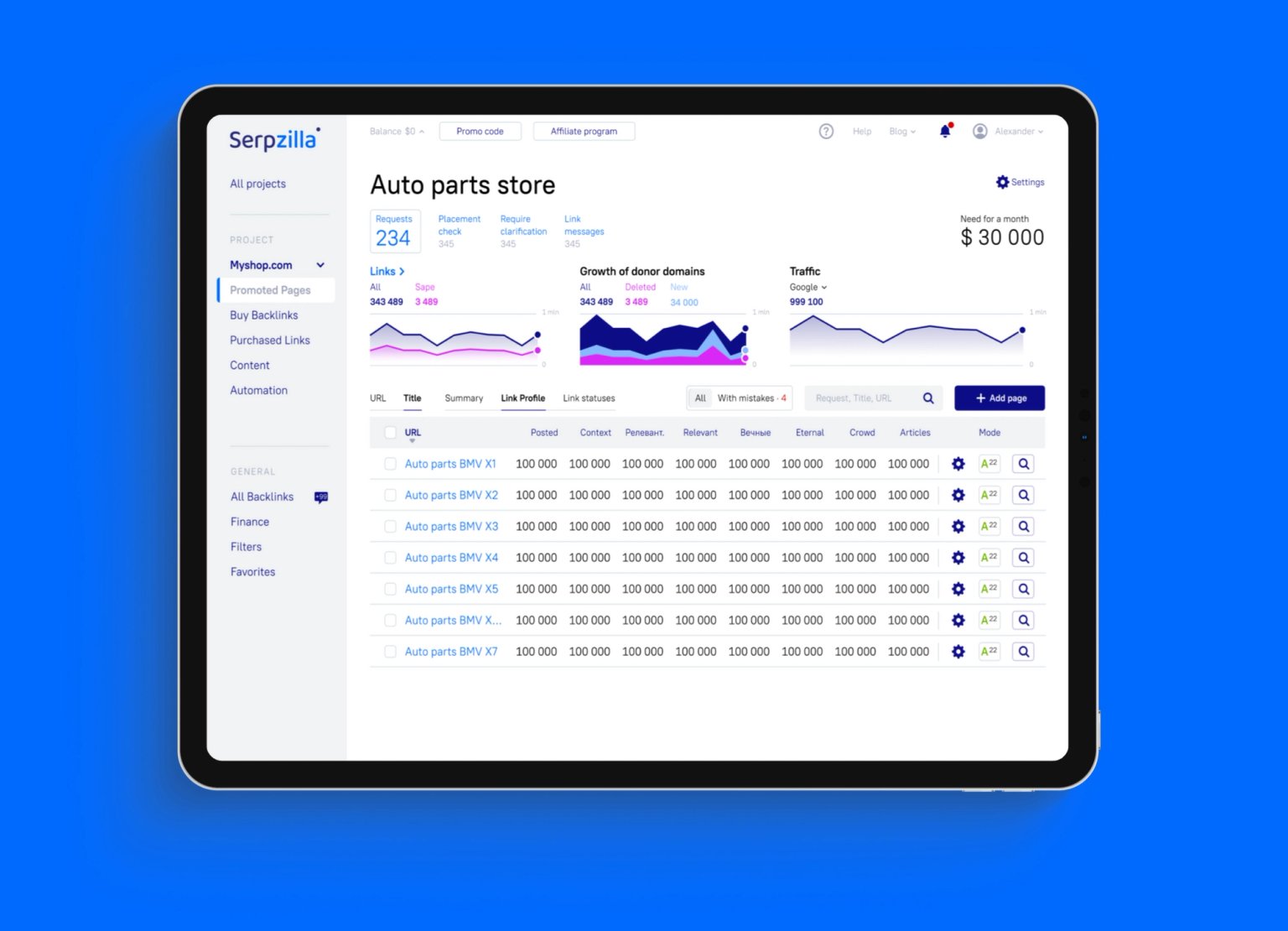
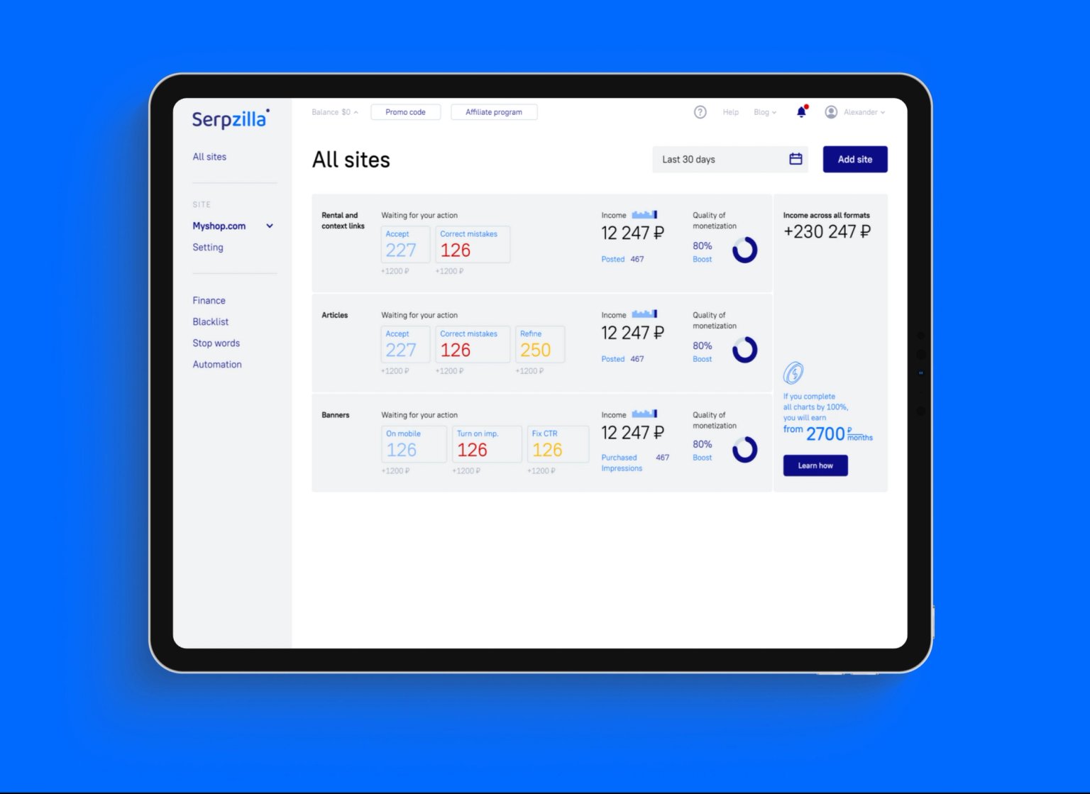
Site owner's cabinet

Recommendation service from artificial intelligence and promotion experts

Media traffic buying service

Result
Design & development as a Service
$5000 /month
What’s included: One task in progress at once · Typical turnaround within 48 hours · Webflow builds included · React and .NET development available · Stop or pause whenever you need
By clicking the button I agree to the processing of my data
Message sent
We'll get back to you soon